Standard line plot using ggplot2. Y-variable not necessary.
line_plot(
  df,
  x_var,
  color_var = NULL,
  y_var = NULL,
  group_by_x_var = TRUE,
  y_percent = TRUE,
  percent_accuracy = 1,
  y_lim = NULL,
  y_breaks = 2000,
  y_breaks_end = 1e+05,
  line_size = 1,
  title = NULL,
  subtitle = NULL,
  y_lab = NULL,
  x_lab = NULL,
  fill_colors = NULL,
  legend_labels = ggplot2::waiver(),
  label_breaks = ggplot2::waiver(),
  legend_row = NULL,
  legend_col = NULL,
  expand = TRUE,
  ...
)
Arguments
- df
Data frame.
- x_var
Variable for x-axis, use string name. Recommended that x_var is in character in df (not necessary).
- color_var
Variable for the different colors in lines, use string name. Use
NULLif only one color for lines.- y_var
Variable for y axis, if
NULL, count is used.- group_by_x_var
Boolean indicating if percentages should be for
x_varorcolor_var.- y_percent
If
TRUE, y-axis is in percent form. Otherwise in count form.- percent_accuracy
Set accuracy for
scales::percent_format().- y_lim
Limit on y-axis.
- y_breaks
Length between each break on y-axis.
- y_breaks_end
Break end, default for 100,000. Works for all count values below that.
- line_size
Size of the lines.
- title
Plot title,
NULLif no title.- subtitle
Small text under title,
NULLif no subtitle.- y_lab
Y-axis label, use
NULLfor no label.- x_lab
X-axis label, use
NULLfor no label.- fill_colors
Colors of the different categories in color_var.
- legend_labels
Label for each legend key.
- label_breaks
Order of the legend keys.
- legend_row
How many rows for the legends.
- legend_col
How many columns for the legends.
- expand
If
TRUE, the margins around the data are kept.- ...
Arguments passed to
theme_slr()
Value
Ggplot object containing line-plot.
Examples
# Example data
df <- ggplot2::diamonds
# y_percent = TRUE
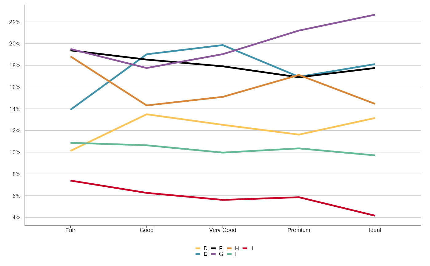
line_plot(df, 'cut', 'color', y_breaks = 2)
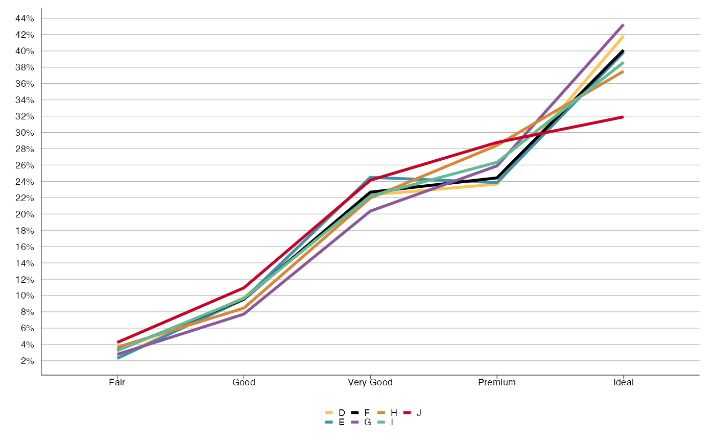
 line_plot(df, 'cut', 'color', group_by_x_var = FALSE, y_breaks = 2)
 # y_percent = FALSE
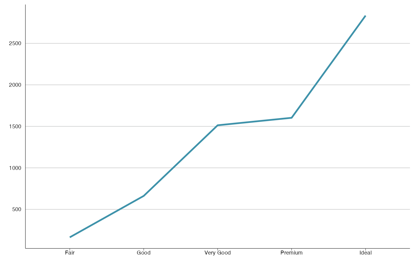
line_plot(df, 'cut', 'color', y_percent = FALSE, y_breaks = 2000)
# y_percent = FALSE
line_plot(df, 'cut', 'color', y_percent = FALSE, y_breaks = 2000)
 # y variable included
df2 <- dplyr::group_by(df, color, cut) %>%
dplyr::summarise(y = dplyr::n(), .groups = "drop_last")
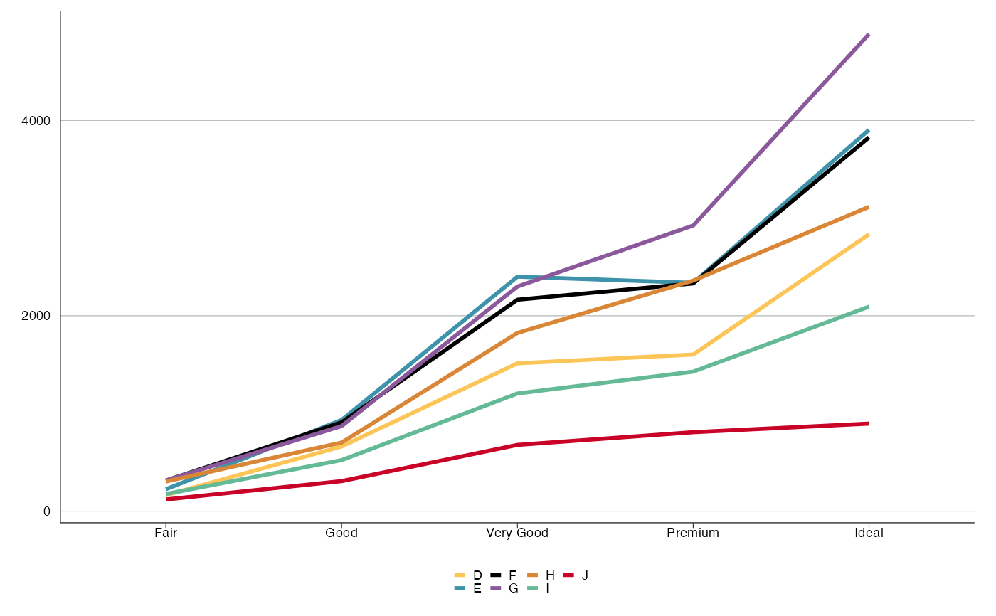
line_plot(df2, 'cut', 'color', y_var = 'y', y_percent = FALSE, y_breaks = 2000)
# y variable included
df2 <- dplyr::group_by(df, color, cut) %>%
dplyr::summarise(y = dplyr::n(), .groups = "drop_last")
line_plot(df2, 'cut', 'color', y_var = 'y', y_percent = FALSE, y_breaks = 2000)
 line_plot(df2[df2$color == 'D', ], 'cut', y_var = 'y', y_percent = FALSE,
y_breaks = 500)
line_plot(df2[df2$color == 'D', ], 'cut', y_var = 'y', y_percent = FALSE,
y_breaks = 500)