Bar plot function
bar_plot.RdPlot a bar plot using ggplot2.
bar_plot(
  df,
  x_var,
  fill_var = NULL,
  y_var = NULL,
  style = c("stack", "fill", "dodge")[1],
  group_by_x_var = TRUE,
  y_percent = TRUE,
  percent_accuracy = 1,
  y_lim = NULL,
  y_breaks = 2000,
  x_breaks = NULL,
  y_breaks_end = 1e+05,
  title = NULL,
  subtitle = NULL,
  title_size = 14,
  subtitle_size = 10,
  title_margin = 1,
  y_lab = NULL,
  x_lab = NULL,
  background_color = "moccasin",
  panel_grid_color = "grey",
  panel_grid_size = 0.3,
  contour_line_size = 0.1,
  axis_size = 0.3,
  axis_text_angle = 0,
  text_size = 8,
  fill_colors = c("#E41A1C", "#377EB8", "#4DAF4A", "#984EA3", "#FF7F00", "#FFFF33",
    "#A65628", "#F781BF"),
  legend_pos = "bottom",
  legend_labels = ggplot2::waiver(),
  label_breaks = ggplot2::waiver(),
  legend_background = "transparent",
  legend_row = NULL,
  legend_col = NULL
)
Arguments
| df | Data frame. |
|---|---|
| x_var | Variable for x axis, use string name.
Recommended that |
| fill_var | Variable for the different colors in bars, use string name. Use NULL if only one color for bars. |
| y_var | Variable for y axis, if NULL, count is used. |
| style | 3 different styles of bar plots, "stack", "fill", or "dodge". fill requires y_percent TRUE. |
| group_by_x_var | Only relevant for style dodge. Boolean indicating if percentages should be for x_var or fill_var. |
| y_percent | If TRUE, y axis is in percent form. Otherwise in count form. |
| percent_accuracy | Set accuracy for |
| y_lim | Limit on y axis. |
| x_breaks, y_breaks | Length between each break on x/y axis. |
| y_breaks_end | Break end, default for 100000. Works for all count values below that. |
| title | Plot title, NULL if no title. |
| subtitle | Small text under title, NULL if no subtitle. |
| title_size | Text size of title in pt. |
| subtitle_size | Text size of subtitle in pt. |
| title_margin | Distance between subtitle and title in pt. If no subtitle, title_margin 0.5*title_size. |
| y_lab | Y-axis label, use NULL for no label. |
| x_lab | X-axis label, use NULL for no label. |
| background_color | Color of the panel background. |
| panel_grid_color | Color of the panel grid lines. |
| panel_grid_size | Size of the panel grid lines in plot, useful to change if large dpi! |
| contour_line_size | Contour around bars size. |
| axis_size | Size of the axis lines. |
| axis_text_angle | Angle of the tick texts, 45 is recommended for many x levels. |
| text_size | Size of the text in pt. |
| fill_colors | Color of the different categories in fill_var. |
| legend_pos | Position of the legend in plot, if c(1,1), c(1,0) etc, legend inside plot. |
| legend_labels | Label for each legend key. |
| label_breaks | Order of the legend keys. |
| legend_background | Color of the legend background. |
| legend_row | How many rows for the legends. |
| legend_col | How many columns for the legends. |
Value
ggplot object containing bar plot.
Examples
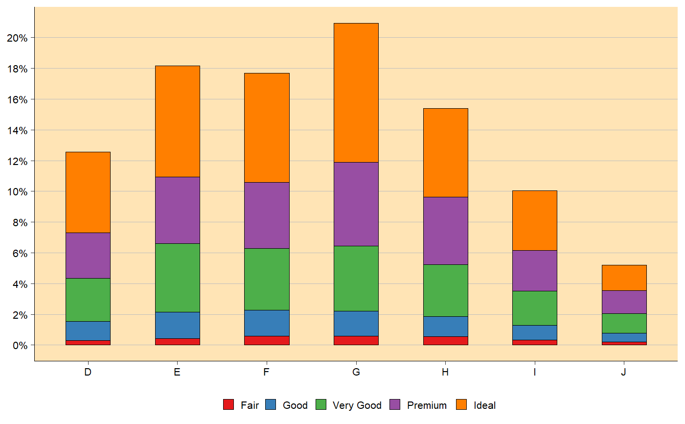
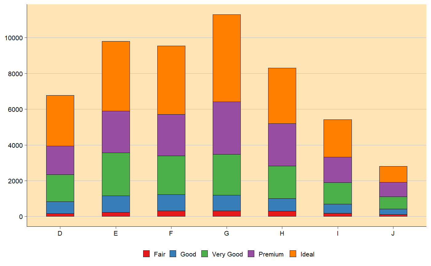
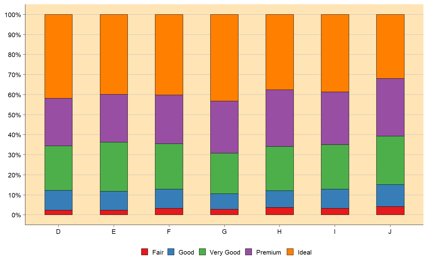
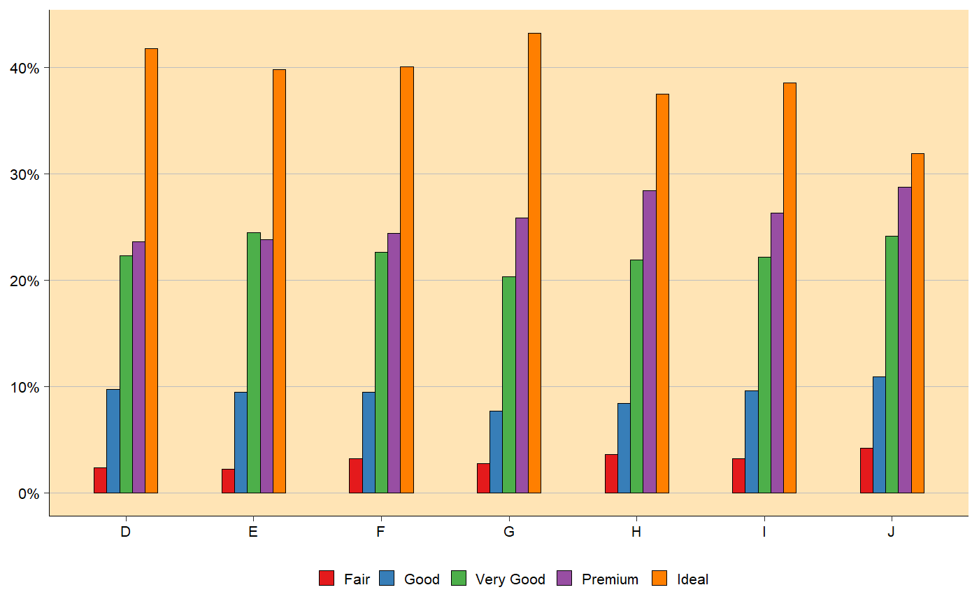
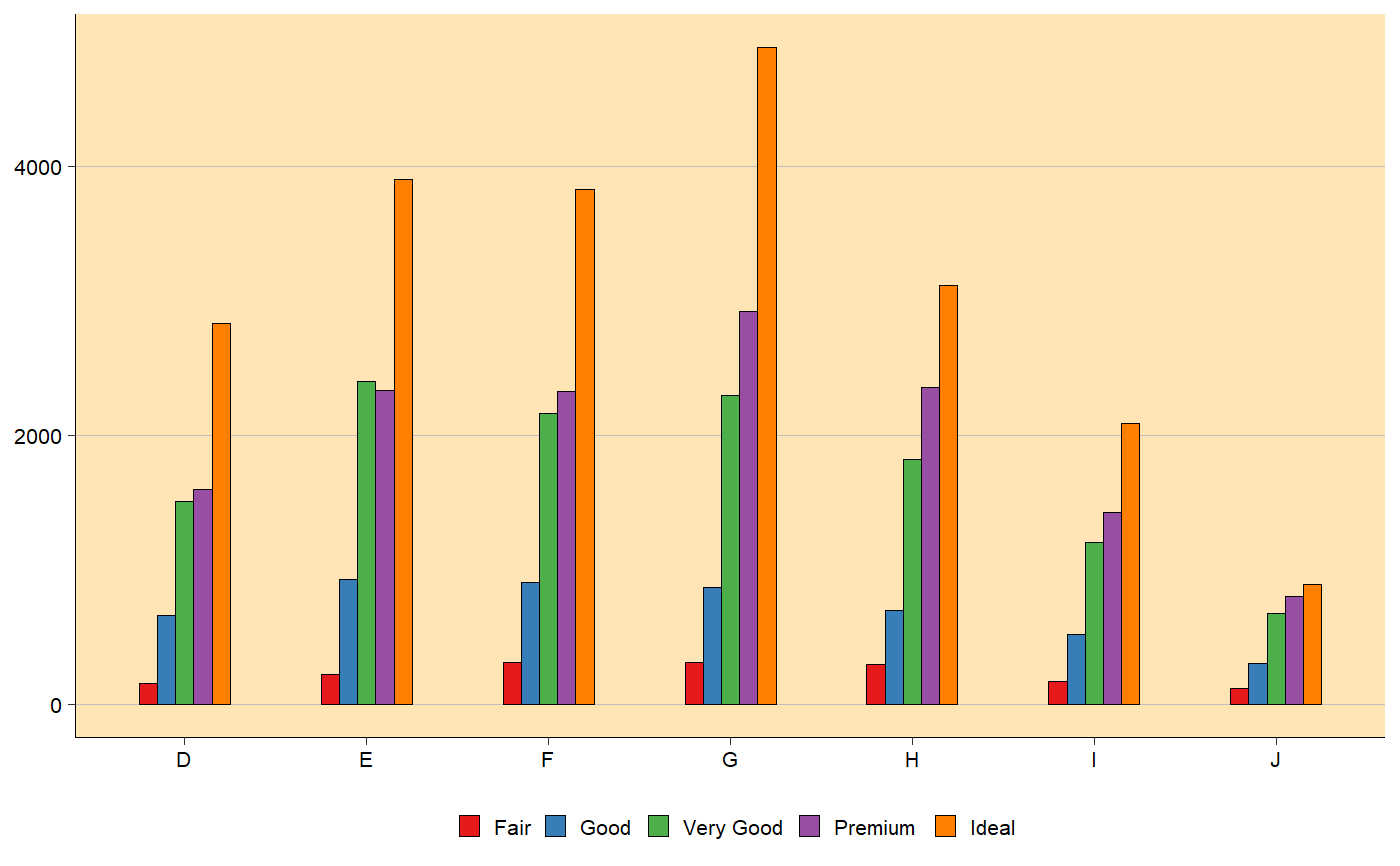
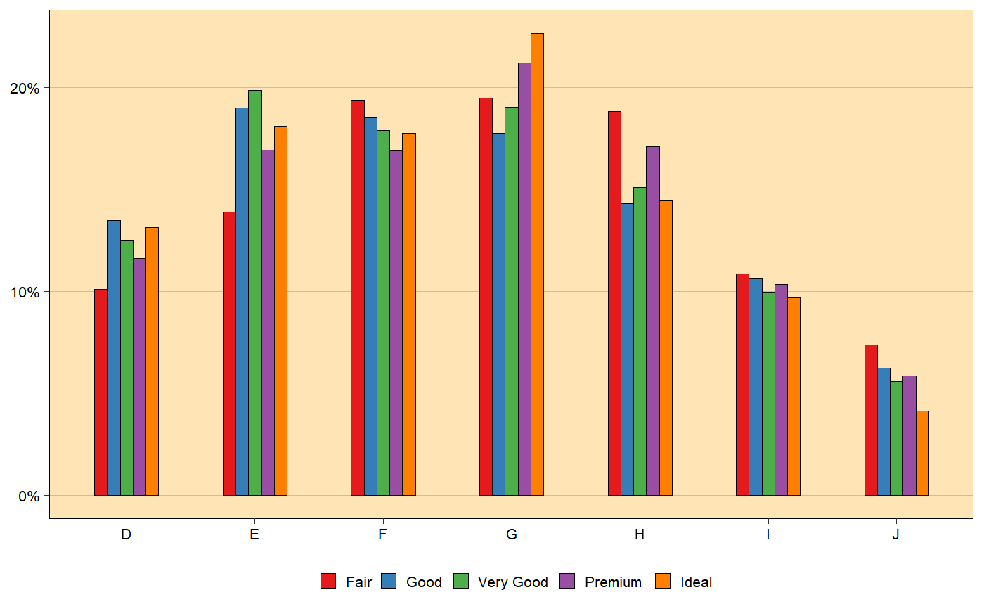
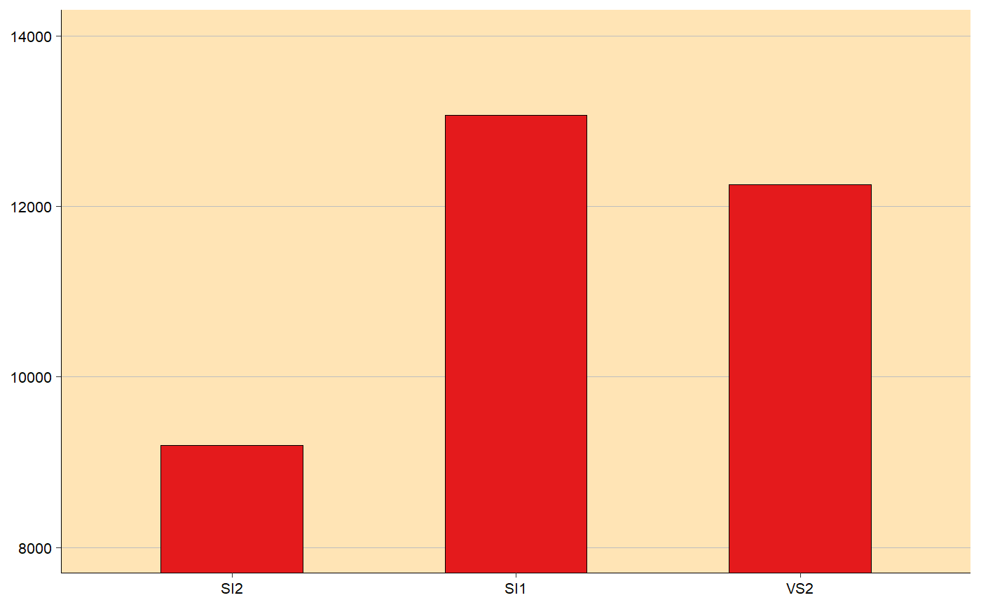
bar_plot(df = ggplot2::diamonds, x_var = 'color', fill_var = 'cut', y_percent = FALSE, y_breaks = 2000)# Style stack with y variable included df <- ggplot2::diamonds %>% dplyr::group_by_('color', 'cut') %>% dplyr::summarise(y = dplyr::n())#> Warning: group_by_() is deprecated. #> Please use group_by() instead #> #> The 'programming' vignette or the tidyeval book can help you #> to program with group_by() : https://tidyeval.tidyverse.org #> This warning is displayed once per session.bar_plot(df = df, x_var = 'color', fill_var = 'cut', y_var = 'y', y_breaks = 2)# Style fill bar_plot(df = ggplot2::diamonds, x_var = 'color', fill_var = 'cut', y_breaks = 10, style = 'fill')# Style dodge grouped by x_var (color in this case) bar_plot(df = ggplot2::diamonds, x_var = 'color', fill_var = 'cut', style = 'dodge', y_breaks = 10)bar_plot(df = ggplot2::diamonds, x_var = 'color', fill_var = 'cut', style = 'dodge', y_percent = FALSE, y_breaks = 2000)# Style dodge grouped by fill_var (cut in this case) bar_plot(df = ggplot2::diamonds, x_var = 'color', fill_var = 'cut', style = 'dodge', group_by_x_var = FALSE, y_breaks = 10)# Since bar_plot() returns ggplot object, it is possible to add more features # Here we zoom the plot using coord_cartesian(): df <- dplyr::filter(ggplot2::diamonds, clarity %in% c('SI1', 'SI2', 'VS2')) bar_plot(df = df, x_var = 'clarity', style = 'dodge', y_percent = FALSE, y_breaks = 2000) + ggplot2::coord_cartesian(ylim = c(8000, 14000))
